 AlphaWhisper
Orbit
Your chart, with the walls already drawn on it
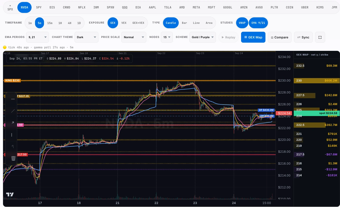
A chart is a picture of what happened. Orbit adds what is waiting: dealer gamma beaded down the price axis, the darkpool blocks institutions defend, and the levels that are actually load bearing, so you stop switching tabs to check whether a level is real.
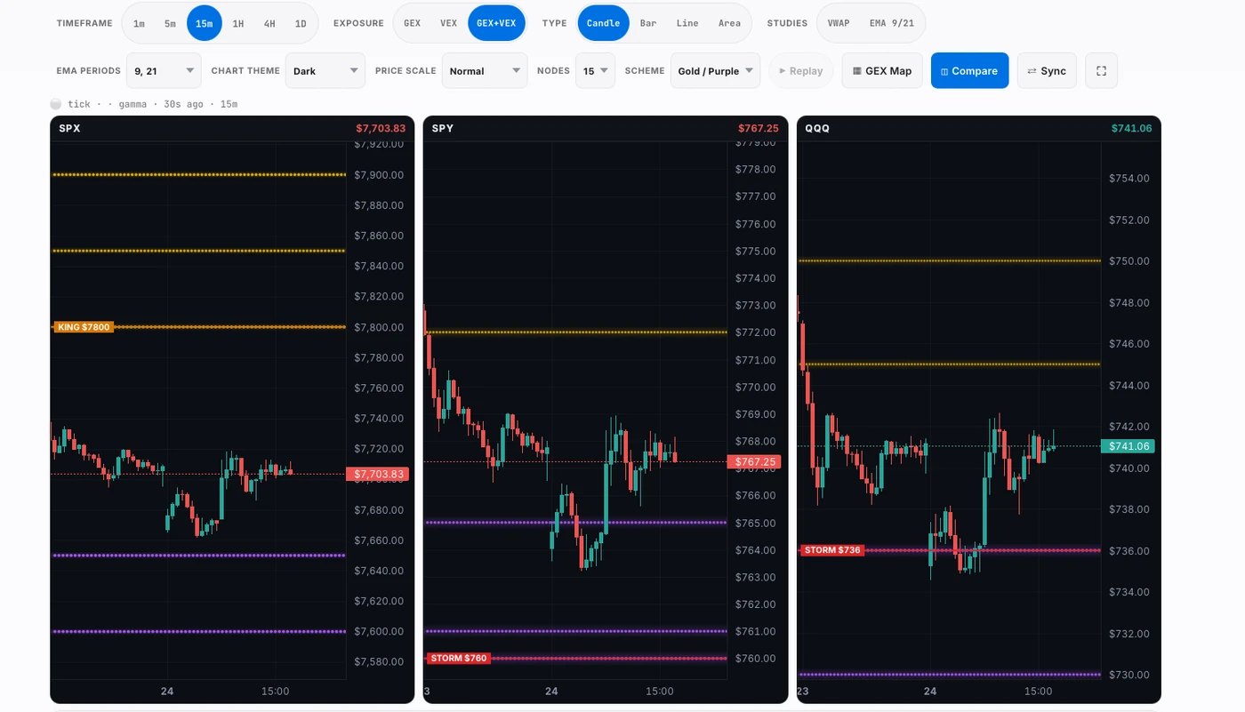
Compare mode: SPX, SPY and QQQ on one screen, each with its own dealer levels drawn and the timeframe locked together. The king node on SPX at $7,800 and the storm levels on SPY and QQQ are the same structure Gravity maps, put where you trade it.
The questions it exists for.
- Is this level structural, or did somebody draw a line on it?
- What is above and below price right now, and how heavy is it?
- Where is the nearest place a move is likely to stall?
- How did this setup look an hour ago, a day ago, a week ago?
What you are actually looking at.
The gamma column
Net exposure per strike, drawn beside the price axis at the height it actually sits. Taller means more money hedging there.
Darkpool levels
Off-exchange blocks mark prices institutions transacted in size and tend to defend.
Timeframes
One minute through daily, with hourly and four-hourly composed from the same session data, so a level means the same thing at every zoom.
Studies and tools
Session VWAP, moving averages, the drawing tools and chart types you expect from a professional chart.
The honest limit.
Orbit draws structure; it does not predict direction. Levels move as positioning changes through the day, and a chart that shows you a wall cannot tell you whether today is the day it breaks.
The rest of the desk, reading the same tape.






Fourteen days free. No card.
You are inside in under a minute, with the whole Pro desk.